Introduction
As UX researcher and design practioner I am providing my services to effectively redesign and revamp ReminderX.
As part of our services, we have broken down our research into two stage in order to solve the following problems:
The first stage of the user research project will help create future direction for the application. In our research we will address what ReminderX wants users to focus on, what problems already exist on the application and how we can solve them for the users.
The second stage of the project will concentrate heavily on user testing and how the user interacts with the product. During this stage we will be able to record how the user interacts with the application, their user experience journey, and the satisfaction of their intended goal.
Vision Statement
ReminderX is an application for Apple and Android devices. This application’s intended use is for the users to utilize the interfaces reminder and to-do list function. This application’s goal is to not only effectively remind users of future goals or appointments, but to provide customers easy use and to gain the trust of those using it. Once the application is downloaded, ReminderX will be effectively noted by its easy minimal use, and integration with other appointment notifications.
Research Approach
As part of our research we have created research protocol in order to record the interviewee’s data. In this stage we have selected 4 participants that fit an ideal customer that would be utilizing this application. The questions asked of the interviewee’s dealt with demographics, reminders that they record already, what they record, and similar use of applications just to name a few subjects. Our interviewee’s consisted of:
• Nick, 27
• Dani, 28
• Kurt, 30
• Kaity, 31
Findings and Recommendations
Interviewee’s data concluded that they would use this mainly for appointments and meetings.
• Average age of interviewee was mid 20’s-30’s.
• The use of a calender was mentioned in three of the interviews.
• Interviewee’s noted that they spend most of their weekdays at work.
• Wanted ease of use in application.
• Needed multiple reminders for future task.
Analyzing all the data from the interviews, we can conclude a user persona. A typical user would be in their mid 20’s-30’s and have a driven career that takes up most of their time during the week. They utilize thier mobile calender to keep track of upcoming appointments and meetings, and need it to be integratable with popular email services such as, google and outlook. They want the app to be easy to use and for the interface to look aesthetically pleasing. They need the trust that the reminder notification will go off at the intended time, and for there to be more than one notication for said task.
Affinity Diagram
User Persona
Design Tenets
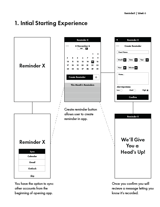
Create easy to use interface: Those that were interviewed described that they needed something easy to use while imputing their reminder. Skip the tutorial and concentrate on making an app that is so simple to navigate that it does not need to be demonstrated. By analyzing the interviewee’s data they are ready to jump in and start using the app to track their meetings and appointments right away.
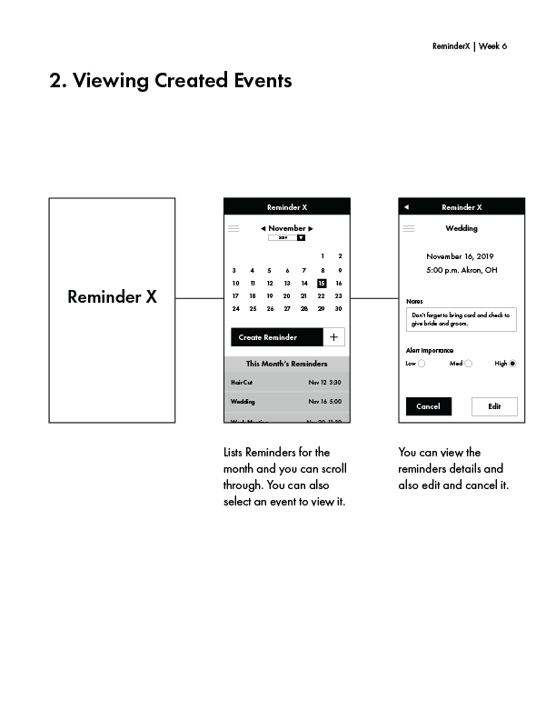
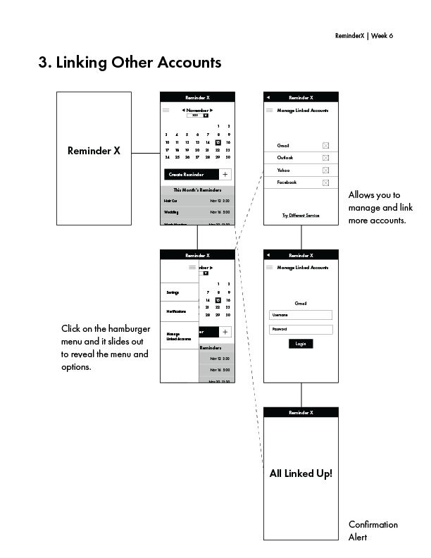
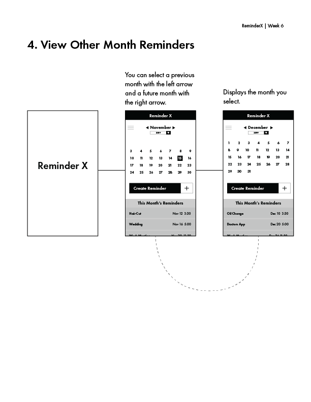
Concentrate on the calender: We received great feedback from the interviewee’s that they mainly go to their mobile calender to review their meetings and appointments. If we focus on a calender as a main reminder interface that will allow us to integrate information through cross-platforms like gmail and Microsoft outlook. By allowing all of those to sync together the user only has to go to one place(ReminderX) to review all their tasks, and to receive the notifications about them.
Enable voice functionality: The user persona we came up with is busy with work and personal their life. Enabling a voice input will help them while they are on the go, and allow them to be more sufficient.
Cross-Platform sharing: By allowing ReminderX to sync with different applications we create an interface that holds all appointments and meetings in one central location. We can create meetings from ReminderX and be able to share with those other applications as well.
Sometimes 15 minutes before is not a great reminder: This is something that we need to weed through during user testing. With the data collected during the interviews there is a need for daily notifications before the actual reminder date. If we consistently have a reminder at the same time everyday as the actual notification time(1 hour before, and then an additional reminder 30 minutes before(Only on the day of reminder)) I believe this will create a mental reminder.
Let the user approach help when needed: There will be the universal sign for help (?) accessible if the user is in need of help with something on the app.
Minimal design is actually more: With an aesthetically pleasing simple to use interface, it will allow users to set reminders easily. Too much clutter on the interface and it will start to frustrate the users and slow them down from achieving their goals.
Wireframes
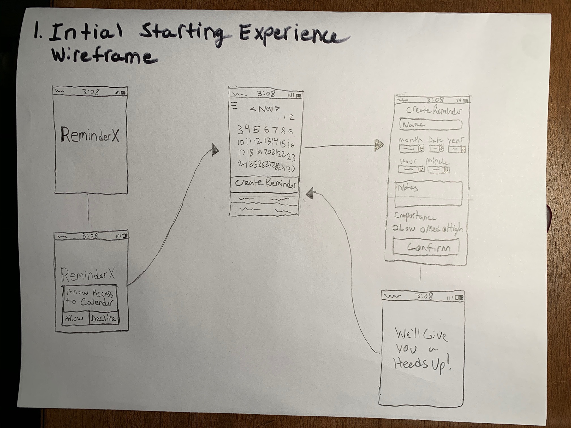
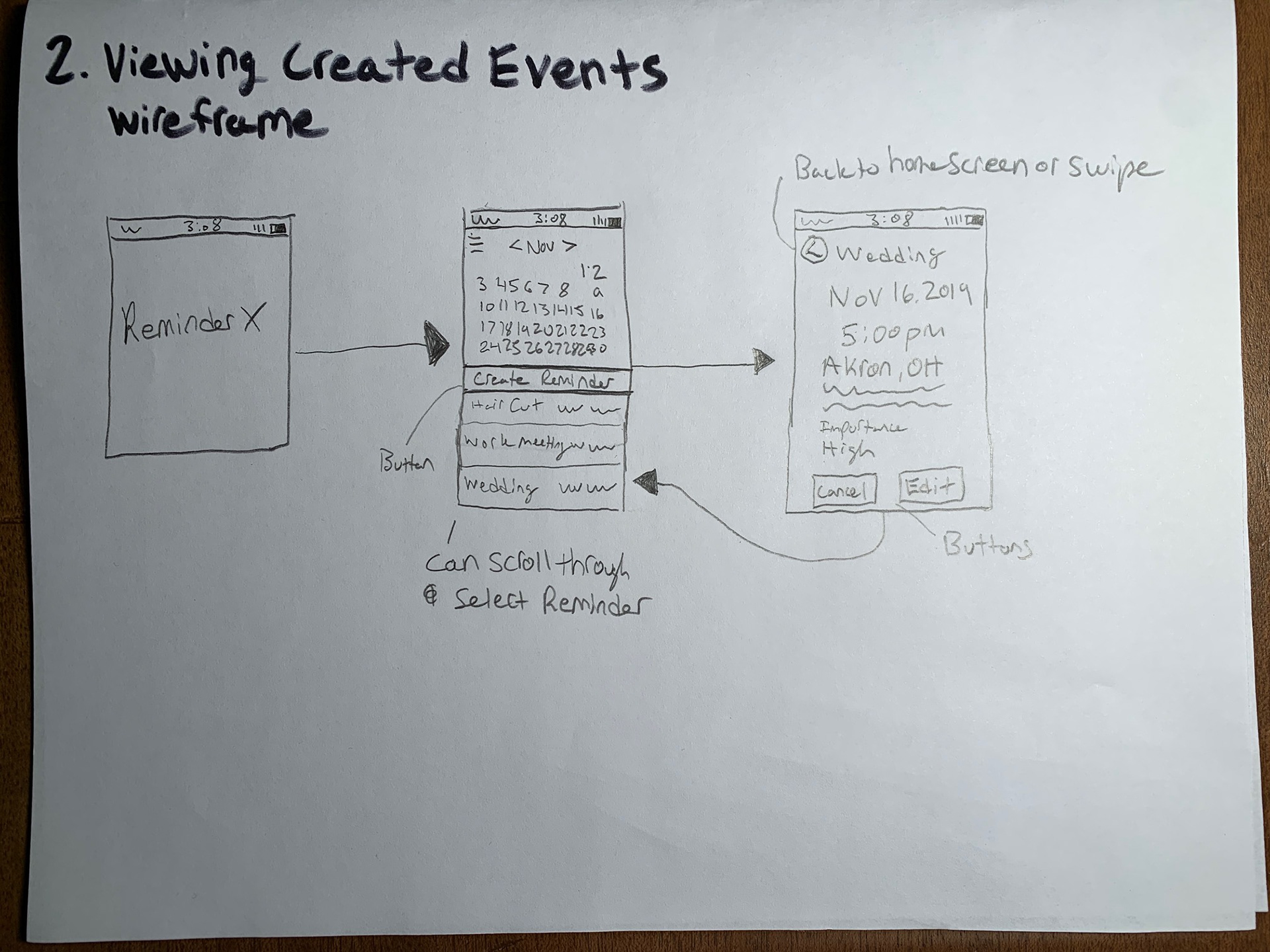
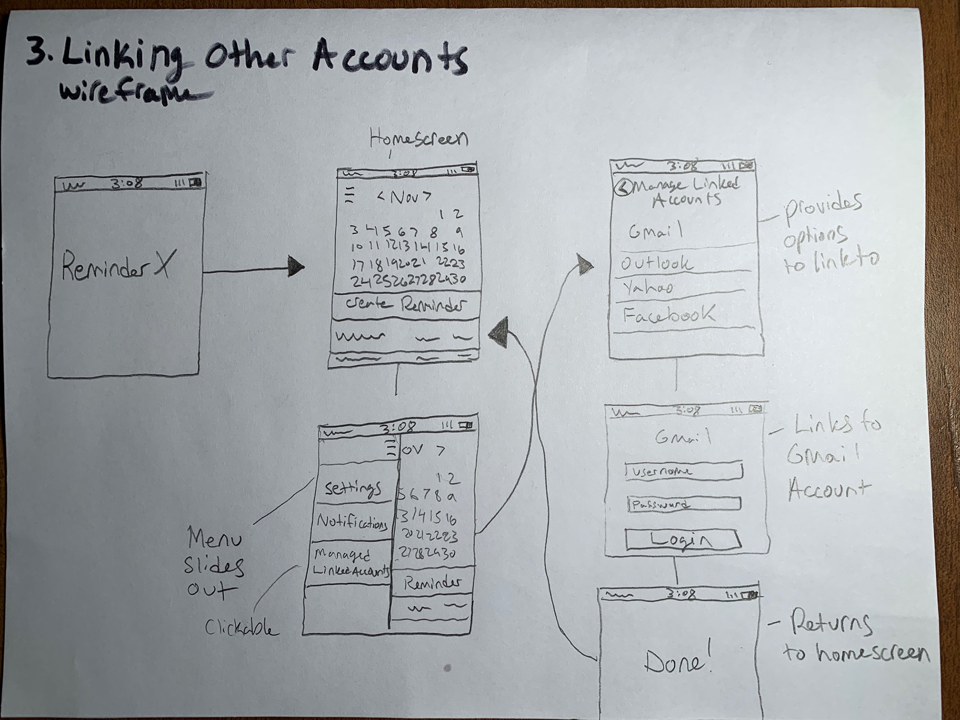

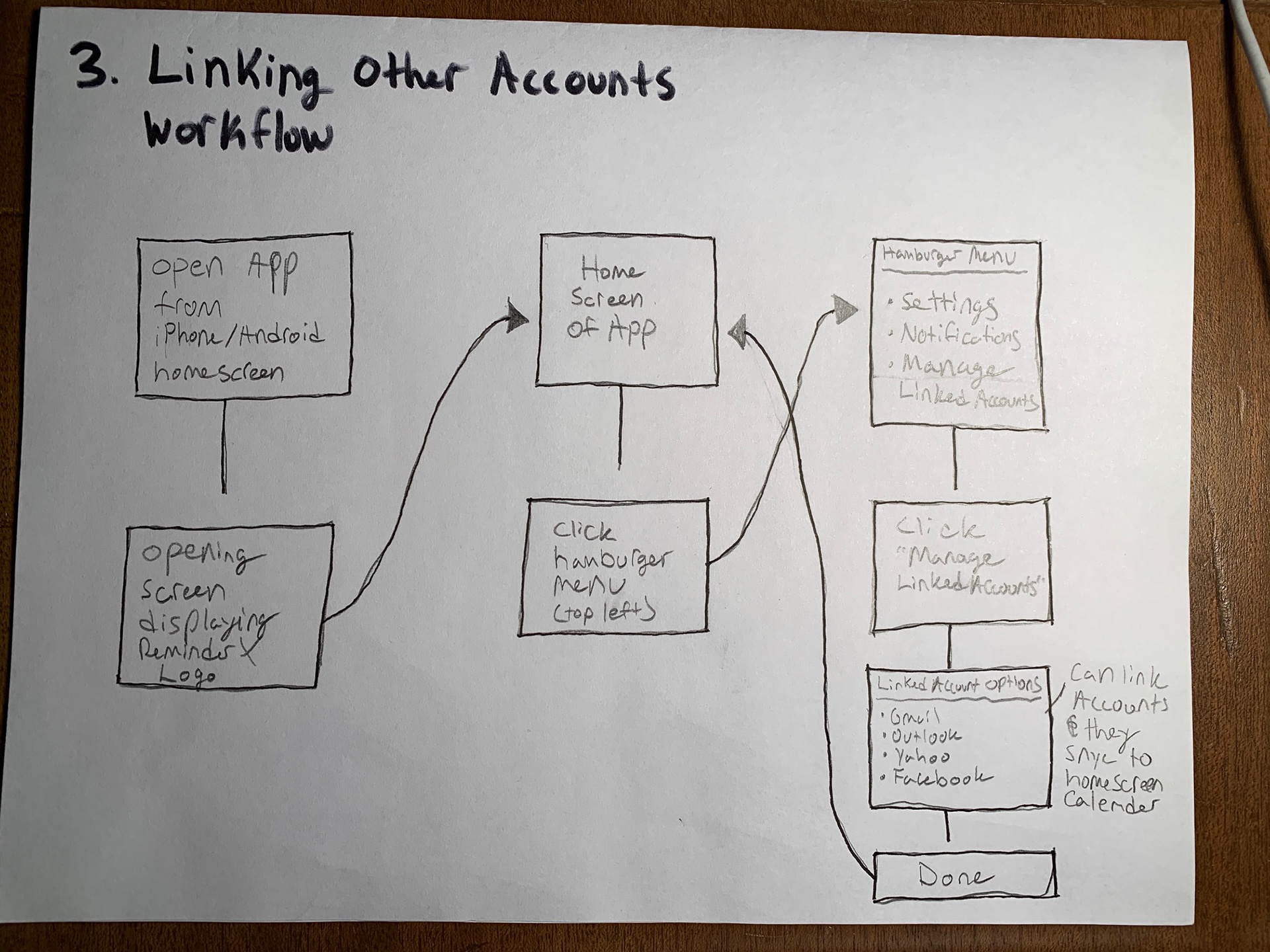
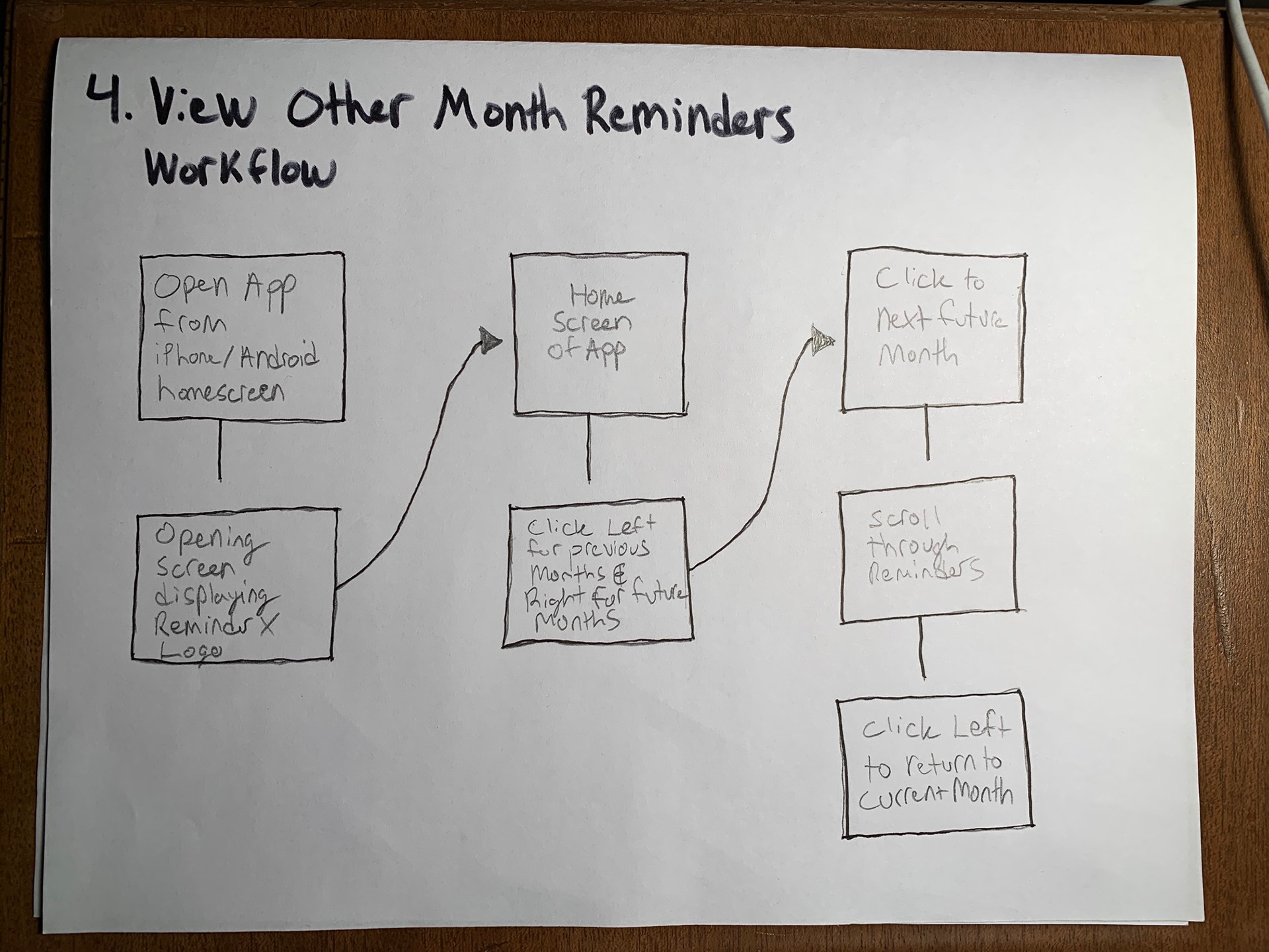
Workflows
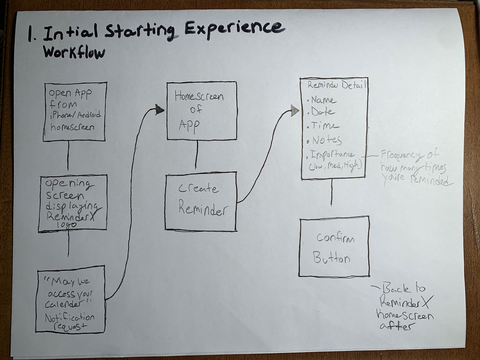

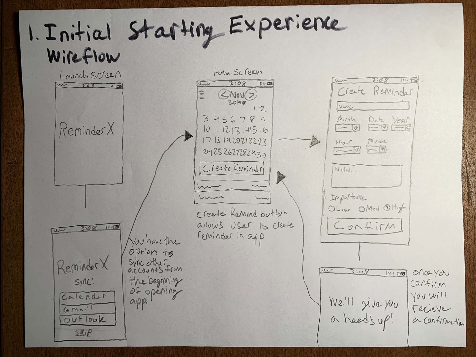
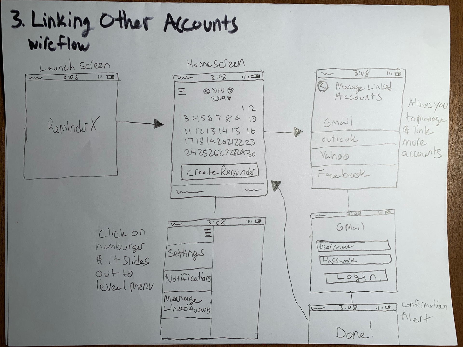
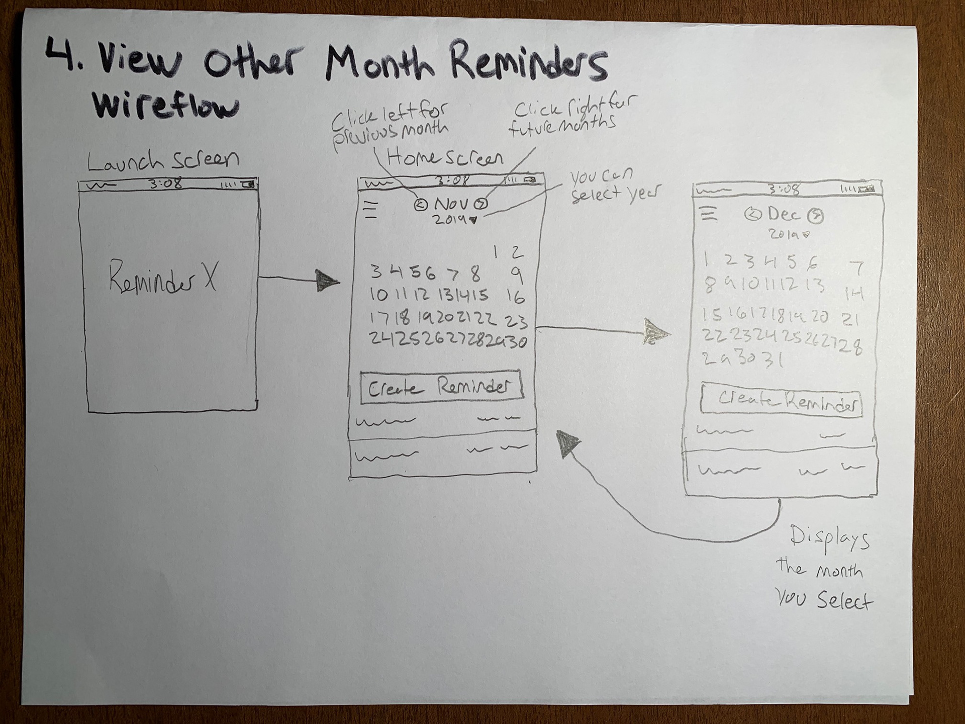
Wireflows

Digital Iterations
